
Adjust the space between letters in text in Photoshop
Hey everyone,
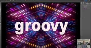
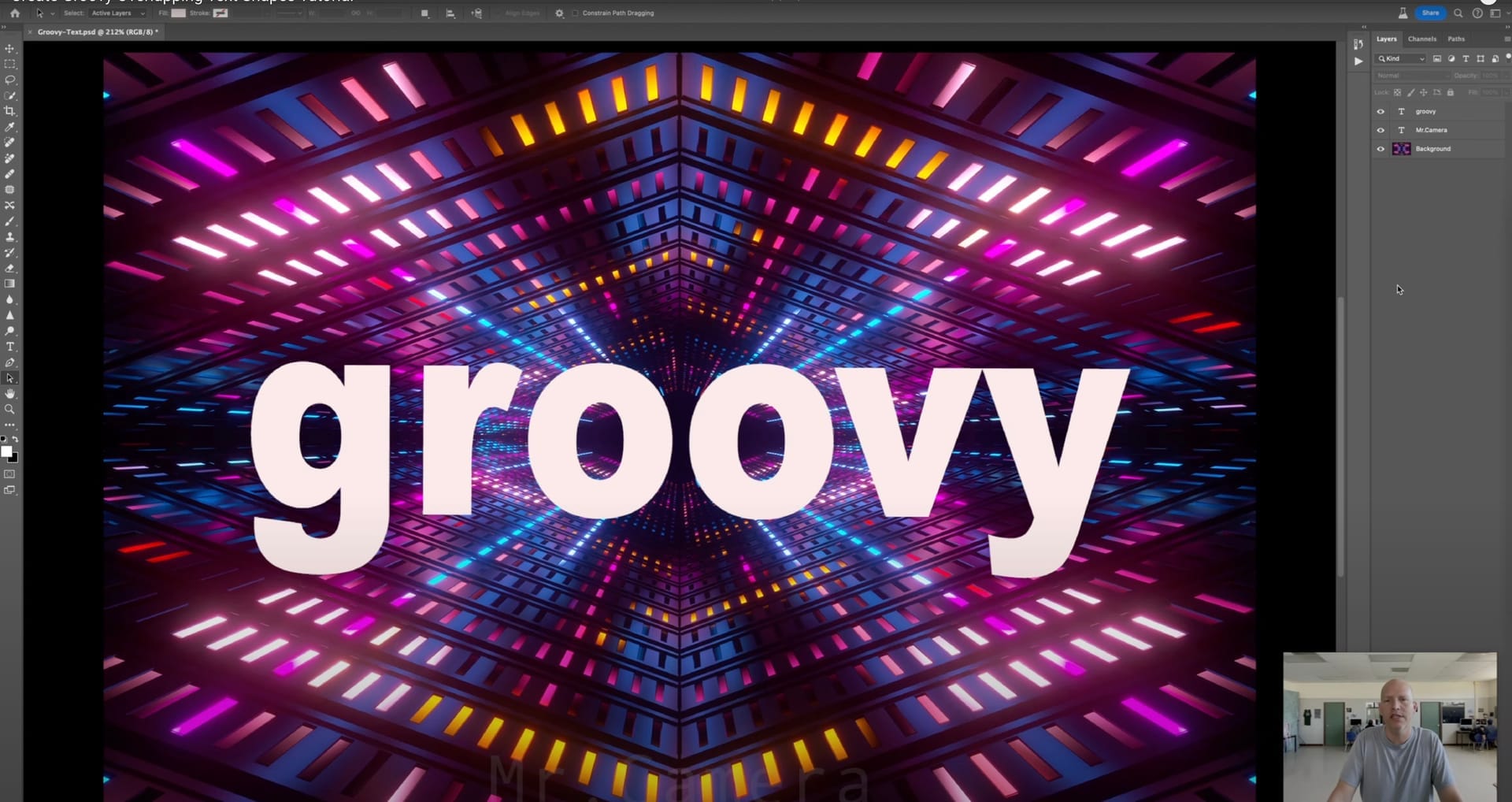
I recently put together a tutorial on adjusting letter spacing in Photoshop, diving into the nuances of kerning and tracking. This might sound a bit technical at first, but the impact it can have on your text and overall design is significant. Adjusting spaces between letters or across words enhances readability and aesthetics, making your work stand out in subtle yet powerful ways.
This is from Schneider on this very topic and decided to explore it further. It turns out, fine-tuning letter spacing is not just a detail but a fundamental aspect of design that can dramatically elevate the visual appeal of your text.
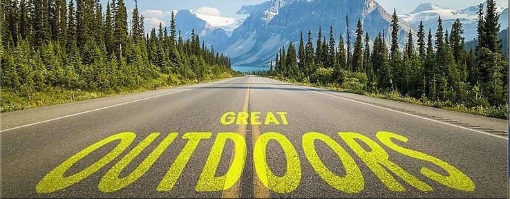
Throughout the tutorial, I experimented with the text "Live Life at Full," adjusting the spacing to find that perfect balance. It’s fascinating how minor adjustments can transform the feel of a word or sentence, making it more inviting or dynamic. For instance, tweaking the spacing between the letters in "THROTTLE" suddenly gives the word a whole new level of energy.
The tutorial is more than a step-by-step guide; it's an exploration of how these adjustments can breathe life into your designs. Whether you're refining a logo or jazzing up a caption, mastering these techniques can add a professional touch to your creations.
Creating this tutorial reminded me of the profound effect that thoughtful design can have, encouraging us to pay attention to the small details that contribute to the bigger picture. I hope it offers both newcomers and seasoned designers insights into the potential of well-spaced text.
Looking forward to seeing your designs come alive with these techniques. Happy designing!
Best,
Mr.Camera


